How is your organization performing against its strategic plan? How far away are you from reaching your goals? What are your priorities and are you on track to achieve them? Is your staff doing what they need to be doing?
If you think you know the answers to these questions, ask yourself whether you really know them or whether you’re just answering based off what your “gut” is telling you. How confident are you in your answers?
For most of us, we’re answering with our “gut feelings” and as strong as those feelings may be, we’re only semi-confident about their accuracy. But what if there was a way to answer quickly, easily, and with 100% confidence? Enter the dashboard.
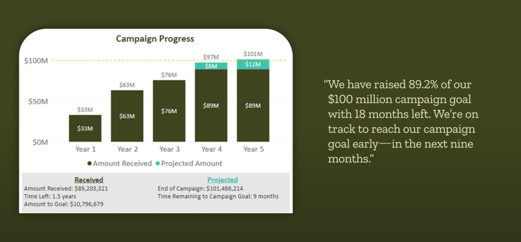
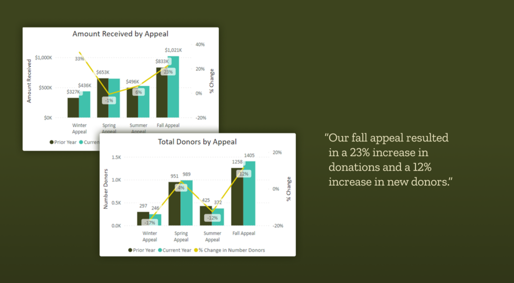
With a few simple clicks, you can have a set of beautiful visualizations that give you a clear snapshot of how your organization is performing against its goals.


At this point, you might find yourself asking, “Okay, but how is this different from a report or a list?” A dashboard is intentionally designed to provide a high-level live summary whereas a report is intended to provide more details in a specific area for a specific timeframe.
Dashboards are intuitive and allow for complex information to be shared with different audiences. For your organization, that may include board members, your director of development, and/or program partners. It is important to remember that different audiences are interested in different topics. Knowing your audience at the beginning of the process ensures that the dashboard is designed to address the concerns of the specific target audience. The chair of the board wouldn’t (or shouldn’t) be interested in how a specific appeal performed last year compared to this year—but will want to see quarterly overall performance.
By using the appropriate visualizations, dashboards provide an at-a-glance overview of key performance indicators. Depending on the audience and the tool used to build the dashboards, users may then be able to drill down into a particular visualization to get more context in that topic. Think of this second level as the “report” or “list.” Fully understanding the report or list is usually dependent on having base-level knowledge of the subject area. The report may also include extra explanation to provide necessary context.
To put it another way, dashboards are like looking at a forest from miles away—you can see the overall tree line but not a ton of the details. At the report or list level, you can see the trees themselves from a few hundred feet away—the brown of the trunks and the green of the trees. As you get closer, you can see more and more of the details. Ultimately you can see the leaves and the trunk details—the data itself that makes up the reports and ultimately the dashboard.
Here are a few more ways dashboards can support your fundraising efforts:
- Dashboards provide an easy way to keep your board informed of your progress while also focusing them on the right information. Designed correctly, dashboards can provide the perfect selection and amount of information to board members to ensure your organization is making data-driven decisions.
- Dashboards provide consistent snapshots in a reliable manner. Gone are the days of having to re-interpret the same data set as it is presented differently today than it was two months ago. Once the visual is designed, the data supporting it just gets refreshed on a regular schedule—the visual you see today is the visual that will be there six months from now, just with updated data.
- Dashboards allow you to keep track of the overall performance of your team and highlight potential areas that may have opportunities for improvement. The dashboard could show that one event is outperforming others—allowing you to dig in with the event team to see what is making it so successful. Or the dashboard could show that you aren’t quite on track towards a particular fundraising goal, helping you focus your attention and prioritize your valuable time.
Ready to get started? Here are some of the next steps to getting you on your way to a dashboard that highlights your data:
- Define your audience: Who will be consuming this information?
- Set your goals and define your metrics: What are your organization’s strategic goals? How do you measure success? See our in-depth article on this here.
- Ensure your data is healthy: What data do you have that helps inform your metrics? For example, if you’re looking at gifts received to date, how are your gift records? Are they clean, consistent, and complete?
- Find the right resources: Do you have someone on your team with the technical skills to build this dashboard? Pull them into the process now! Having them involved from the beginning is vital. (If you don’t have the right resource, Benefactor Group is here to help!)
In our upcoming installments, we’ll walk you through the process of creating a dashboard in more detail. We’ll provide guidance in determining your audience, what to include on your dashboard, and then how to design your dashboard in an easy-to-read but impactful way.

